Royal Ascot is in many ways similar to a catwalk show.
Everyone makes a tremendous effort to look stunning with his or her hair, clothes, shoes, makeup (mainly women for makeup) and some fashion conscious loveys want to ensure they are bang on trend for this yearly event!
So at Sports Hospitality Partnership, we have undertaken the arduous task of researching what colours are in fashion for 2014.
After reading through hours of fashion magazines, blogs, articles and interviewing all of the top fashion creators in the United Kingdom (honest!) we found this marvellous breakdown of colours…
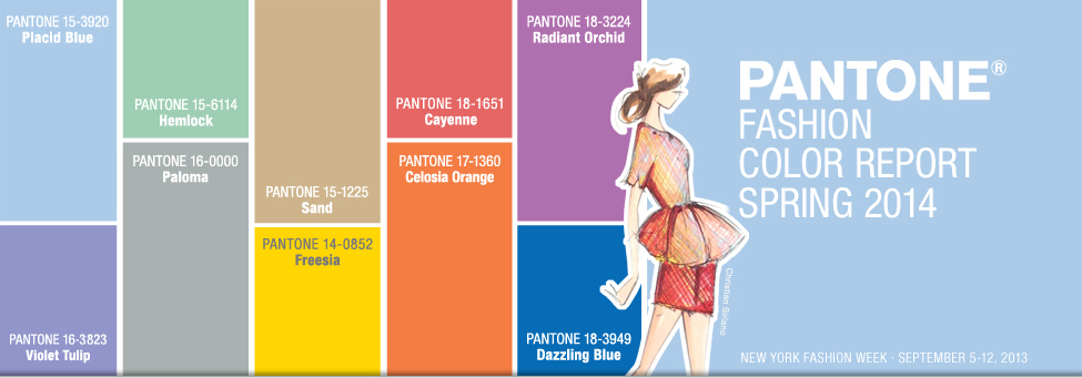
Three very adaptable pastels sit on one end of the palette, and, because we are so accustomed to seeing them as nature’s background, they can be creatively combined with any other colour in the spectrum.
Placid Blue, like a picture-perfect, tranquil and reassuring sky, induces a sense of peaceful calmness.
Violet Tulip, a romantic, vintage purple, evokes wistful nostalgia. Similar to the verdant shade of springtime foliage.
Hemlock, a summery, ornamental green, provides a decorative touch that’s very different from the greens of recent seasons. Pair any of these versatile pastels with a bolder hue for an au courant look.
Sand, a lightly toasted and amiable neutral, conjures images of the beach and the carefree days of summer. Try pairing Sand with Hemlock for perfect, natural balance.
Paloma serves as a quintessential neutral, interesting enough to be worn alone or combined with any colour for sophisticated poise.
Cayenne, a high-pitched red, adds a dash of spicy heat to neutrals, and heightens the excitement when mixed with Freesia, a blazing yellow that is sure to illuminate wardrobes this season.
A tropical, floral-inspired shade, Freesia’s warmth and energy help set the stage for Celosia Orange, an optimistic, spontaneous hue. Pair Celosia Orange with Violet Tulip for a captivating vision, much like the setting summer sun.
The palette is brought full circle with Radiant Orchid, a bold counterpart to Violet Tulip, and Blue, a scintillating, polar opposite to Placid Blue. Surprisingly, these strong, vibrant colours also pair well across the palette: They are perfect companions to pastels, and add confidence and vivacity when mixed with other bold colours.
The above information has been taken from Pantone, who for more than 20 years, have been the global authority on colour, and have surveyed the designers of New York Fashion Week and beyond to bring you the season’s most important colour trends.
We hope this blog helps you become a fashionable sensation at Royal Ascot for 2014!